how to design a cannabis dispensary
An in-depth guide to designing a dispensary that’s not only beautiful, but also profitable and highly functional — packed with insider tips and practical strategies from a pro.
1. Identify Your Demographic
First things first — know your audience. Who is going to be your main customer, and who do you want to attract with your branding, design, and operational flow?
Of course, your dispensary should be accessible and welcoming to everyone. But having a target demographic in mind, based on your location, can make your business model much stronger.
For instance, urban environments allow more flexibility with aesthetics and branding since demographics are varied. Suburban locations, on the other hand, might require a more approachable and educational design—think local parents trying cannabis for the first time.
Knowing your demographic will inform decisions about layout, branding, events, and customer experience, ensuring your dispensary appeals to the right mix of shoppers.
The Three Types of Customers
Every dispensary needs to design for these three:
The Experienced Shopper – knows what they want, often looking for specific strains or trusted brands.
The Occasional User – familiar with cannabis but not deeply knowledgeable; appreciates recommendations and clarity.
The Novice – brand new, possibly nervous; needs a space that feels approachable, non-intimidating, and supportive.
Understanding these three types helps shape your sales flow, signage, and interior design choices.
2. Why Branding Is So Important
Your name can say you’re a dispensary — your colors don’t have to.
Yes, green, black, white, and wood tones are classic, and there’s nothing wrong with them. But cannabis culture is vibrant, fun, and creative. Why not let your design reflect that?
Aside from being an amazing plant medicine, cannabis is fun — and the users are fun too! Cannabis users often enjoy bold colors, patterns, and visually engaging spaces. I think back to my college dorm days of tapestries, blacklight posters, and groovy textiles — why not embrace that energy in your dispensary design? After all, the point of legalizing “adult-use” cannabis is that it can be enjoyed recreationally. Capitalize on that.
A few color palettes I would love to see for cannabis branding:
Turquoise, lavender, and yellow
Pistachio, coral, and ice blue
Red, orange, and teal
Who Are You in the Cannabis Community?
Your brand identity is the guiding force behind everything: your store design, your customer experience, and your marketing.
If your brand is wellness-centered: You might create a spa-like interior, a sales flow that emphasizes hands-on education, and marketing focused on cannabis’ health benefits.
If your brand is playful and tourist-friendly: Your dispensary could feature bold colors, Instagrammable moments, creative merchandising displays, and experiential events designed for a social crowd.
Let’s be honest — is anyone else a total sucker for beautifully designed packaging? 🙋🏻♀️ If your target market is younger and trend-driven, don’t be afraid to put that pretty packaging on display.
Pro tip: Hire a branding team alongside your interior designer. This ensures your interior and branding work seamlessly together, giving your dispensary a cohesive and memorable identity.
3. How to Choose a Sales Flow Model
Your sales flow model depends on your space, your staff, and the kind of customer experience you want to create. This is a highly individualized decision that should start with a charette between the license holders, stakeholders, and management. Regardless of which model you choose, incorporating a pick-up window or designated area for online and mobile orders is a smart way to serve the Experienced Shopper—those who know exactly what they want. It creates a quick, seamless experience that can make your store their go-to destination.
Some of the main models include:
Kiosk / Apple Store Style – Interactive and tech-forward.
POS Counter Only – Traditional, streamlined, and efficient.
Hybrid – A mix of counter service and interactive kiosks.
Interactive Omni-Channel – Combines online, in-store, and experiential elements (check out The Peak Beyond for inspiration).
There’s no one-size-fits-all solution, but the earlier you define your model, the smoother your design process will be.
1. Kiosk / Apple Store Style
Think sleek, modern, and tech-driven. Customers browse on iPads or digital kiosks, select what they want, and then check out with ease.
Pros: Premium feel, efficient, education-rich. Great for tech-savvy shoppers.
Cons: Higher investment, less personal interaction, no tactile experience for shoppers.
Design Tips: Keep the layout wide open and minimal, with floating shelves and modular displays. Bright, even lighting creates a clean, gallery-like vibe. Anchor the room with a glowing back wall or digital brand canvas that makes a bold statement.
2. POS Counter Only (Traditional)
This is the classic pharmacy-style model. Customers line up, consult with a budtender, and make their purchase right at the counter.
Pros: Simple, straightforward, and highly personal. Great for sales floors with a limited amount of square footage.
Cons: Can feel transactional, longer wait times, limited browsing, and can be intimidating for The Novice.
Design Tips: Use glass counters and a strong brand wall behind the budtenders to elevate the counter itself as a focal point. Warm lighting softens the experience, while small touches like seating, greenery, or educational graphics make waiting less sterile. Consider adding lots of educational signage (digital or print) for customers to read while waiting in line. You can even monetize the walls by offering vendors premium marketing real estate.
3. Hybrid Model
A mix of kiosks, counters and/or “floating” budtenders, this style offers flexibility and appeals to a wider range of customers. Tech lovers and Experienced Shoppers can self-serve, while others can get one-on-one guidance.
Pros: Versatile, reduces bottlenecks, accommodates different shopping styles.
Cons: Requires thoughtful planning to avoid feeling disjointed.
Design Tips: Flow customers first toward browsing stations, then naturally into checkout. Integrating sales kiosks into wall displays streamlines the flow by keeping stationary customers out of main walkways. Kiosk tables can be integrated on the sales floor, but should be positioned away from core merchandise zones so browsing flow remains uninterrupted. Use layered lighting to highlight product zones, and consider a sculptural display or central kiosk as your “brand moment.” Modular fixtures give you room to pivot as your market evolves.
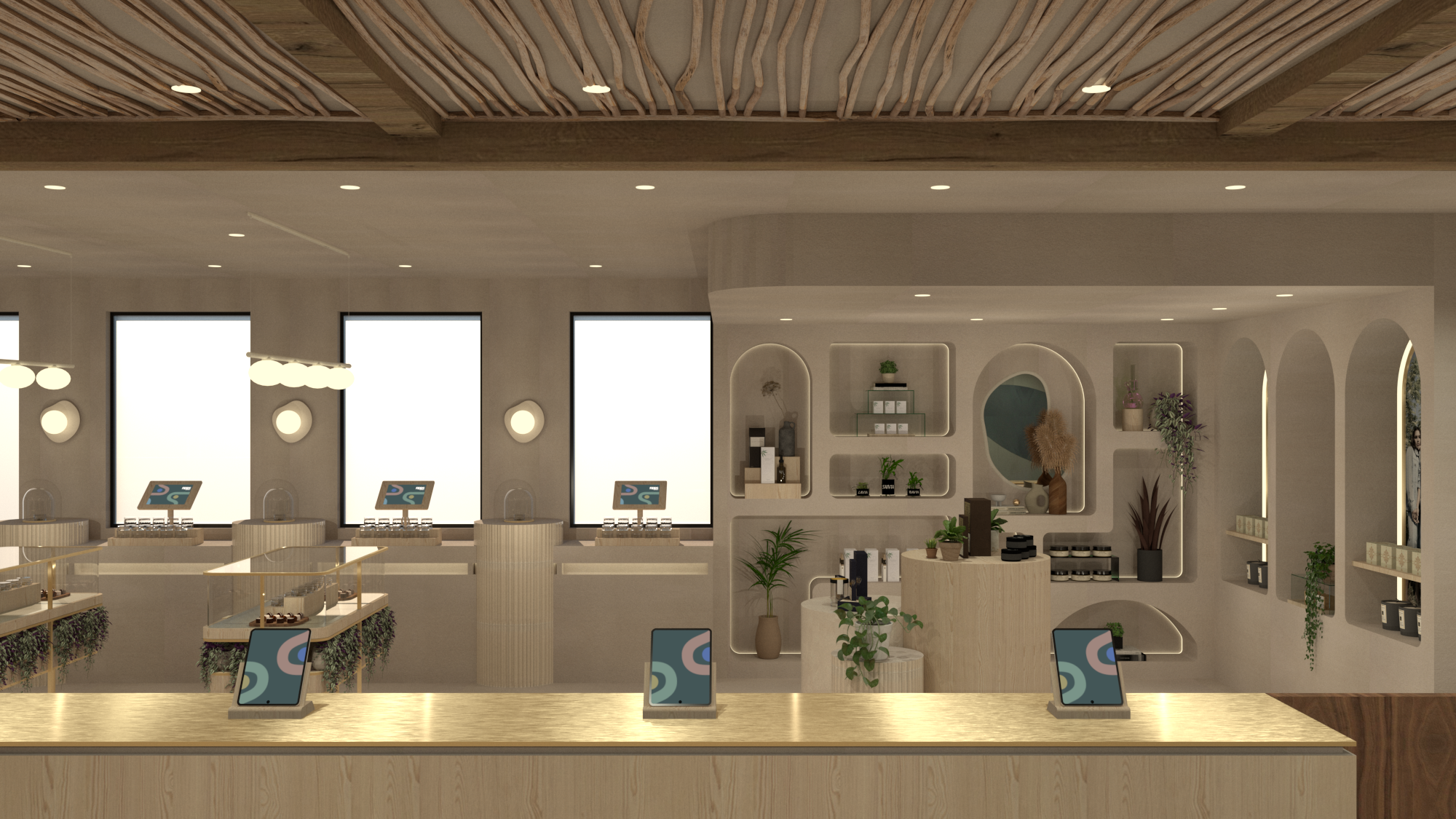
4. Interactive Omni-Channel Technology (My Personal Favorite)
The future of cannabis retail. This is where dispensaries become destinations, blending in-store, online, and experiential design. Customers might pre-order online, explore educational walls, or lounge in branded lifestyle zones.
Pros: Immersive, memorable, shareable — builds deep brand loyalty. Provides budtenders with added sales support and empowers customers to explore products by brand, category, effect, or any custom organization in your e-commerce platform. Integrates with many point-of-sale systems.
Cons: Higher initial overhead costs.
Design Tips: Create a journey, not a line. Break the space into zones: For omni-channel solutions, I believe this works best when organizing merch by product type (edibles, pre-rolls, tinctures, etc). This option lends itself to having a very high-end boutique feel with wall displays and merchandise tables featuring built-in kiosk screens. A clean and sophisticated merchandising style pairs well with this technology. When using this model, it’s best practice to maintain the same user interface across all technology (self-serve kiosks, quick checkouts, interactive displays) to ensure a cohesive customer experience.
I also need to give a shout-out to one of my favorite brands, The Peak Beyond. They dominate in this space and their level of care and attention to detail is unmatched. I highly recommend them for any and all of your kiosk/self serve or omni channel solutions.
Merchandising Pro-Tip: Showcase just one product per SKU in a clean, organized way. Limiting vendor swag (or reserving it only for key marketing moments) creates a sophisticated shopping experience free from clutter and visual overwhelm.
Your dispensary sales flow isn’t just about moving people through a space — it’s about shaping how they feel while they’re there. Whether you want to keep it simple and service-driven, or go all-in on building a flagship destination, the right design choices can elevate your dispensary from a shop into a true brand experience.
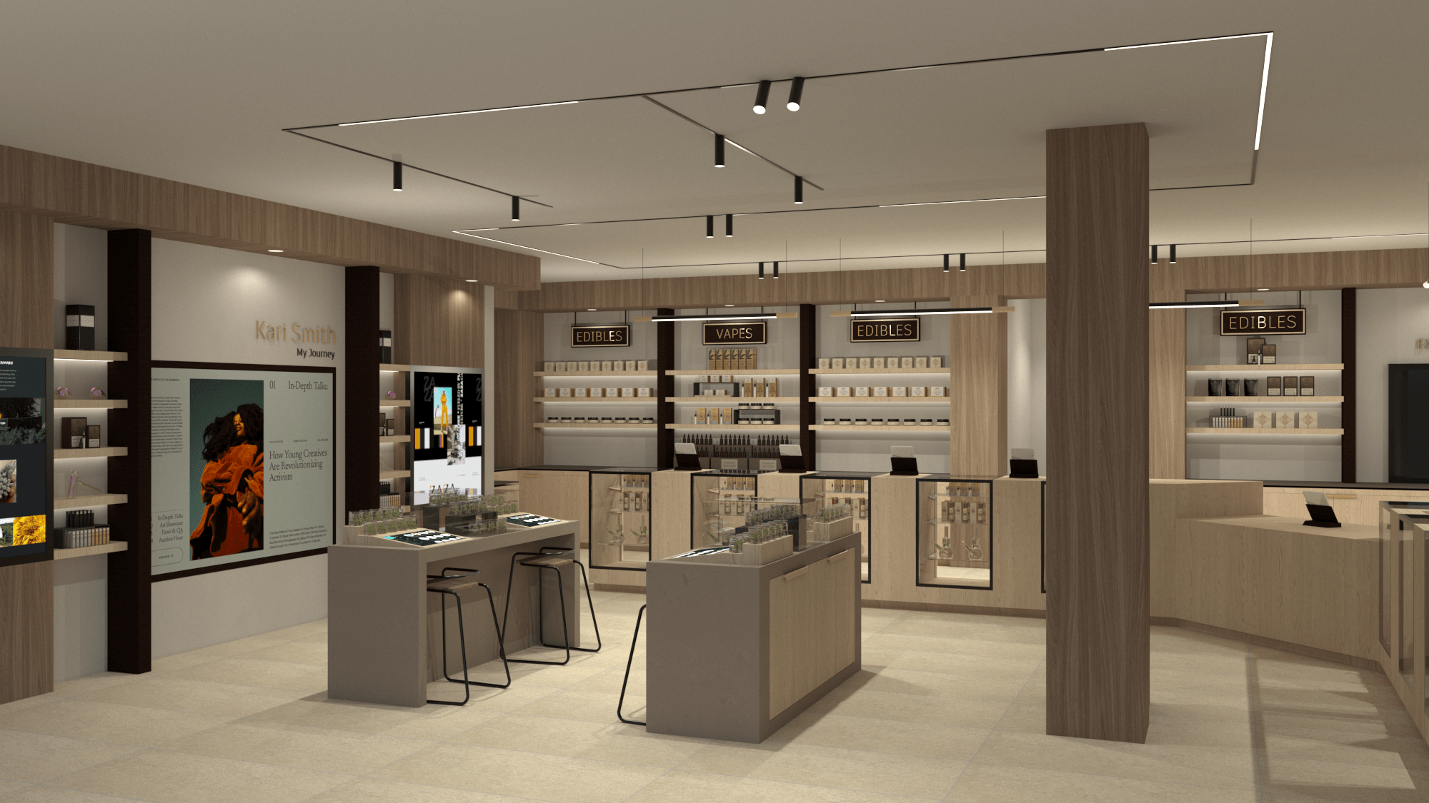
Flower scenting jars are placed along the windows utilizing daylighting and keeping stationary customers out of main walkways.
Interior Design by Studio 36
4. Merchandising and sales floor Layout
While dispensaries have their own set of rules when it comes to merchandising and customer flow, the tried and true retail store design strategies rooted in psychology still apply. Getting your merchandising layout right isn't just about aesthetic—it’s about tapping into how people think, feel, and move.
Here are some general guidelines to follow:
Start with a Welcoming Entrance (Decompression Zone):
The first 5–15 feet inside your dispensary is when customers reset from the outside world—called the decompression zone. A clean, calm entry lets them settle in; overload with clutter or signs too early, and you risk losing their interest before you’ve even begun. If you have a larger space and it feels empty, you can place a small centralized table with marketing or brand swag.Guide with Natural Flow and Right-Turn Behavior:
Most people instinctively turn right upon entering a store, (perhaps because we drive on the right side of the street?). That makes your right-side wall retail real estate. Think high-margin or new products at play here—that first turn sets the tone for exploration.Use a Loop (Racetrack) or Flow Layout:
Rather than straight aisles, use a smooth path—often designed as a racetrack—so customers naturally circulate through key merchandising zones, boosting dwell time and product exposure. If you have a larger sales floor, opt to have live flower product / senting jars placed on tables in different zones. This will encourage shoppers to move throughout the entire store.Position Products at Eye Level:
It’s not invention—it’s fact: eye-level is buy-level. Featured or premium products placed here get more attention than items in lower spots. Reserve lower or higher shelves for less-prominent items (swag or other cannabis paraphernelia).Leverage Impulse Zones Strategically:
Checkout lines and counters are merchandising gold. Opt for product “dump tables” over your traditional stanchion lines. This helps increase individual transaction prices by adding on small items like lighters or rolling papers.Create Sensory-Driven Engagement:
Lighting, scent, and music do more than decorate—they manipulate mood and pace. Bright lighting energizes; softer lighting invites browsing. Pleasant scent or curated music encourages customers to linger and explore. Scenting bars for flower or terpenes are a great interactive shopping experience that keeps your customers engaged.Avoid Visual Overload—"Less is More":
Too many options can lead to shopper paralysis. Studies in consumer psychology show that when choices are limited, customers are far more likely to buy. The key is to curate with intention: guide your shoppers rather than overwhelm them. In practice, this might mean highlighting only your top SKU’s on the floor and keeping shelves free of excess clutter. I also recommend limiting vendor swag unless it’s used strategically—for example, large stationary marketing posters that can be swapped out easily. Bonus: this wall space can even become an additional revenue stream by renting it out to vendors.Direct Navigation with Signage
Utilize wayfinding signage to ease and enhance customer experience. Label different zones with category signage to direct customers. If you have a large space, make sure you are placing signs in stragetic locations to guide customers to their desired location (quick check-out, self-order kiosks, ATM, restrooms, etc.).
Digital Menu Boards
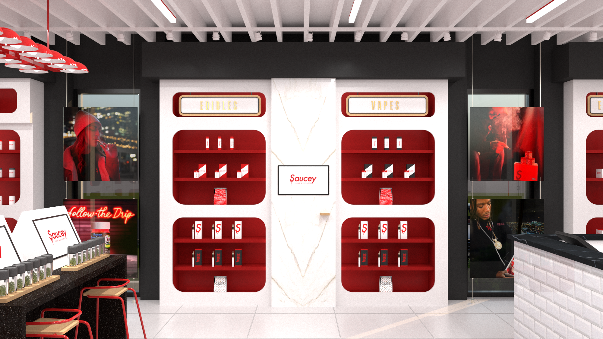
Menu boards work well in the POS Counter Only sales flow model, but I generally avoid them in other formats. They tend to feel impersonal (and frankly, a little boring), often cause congestion at the counter, and—at this point, you know how I feel about the back wall—that space is far too valuable to waste when it could be transformed into a stunning branded moment instead.
Pro-Tip: Use sigage solutions that can be easily changed out - chalkboards, letter boards, magnets, or studio rollers.
In short: Your dispensary should do more than house products—it should guide behavior. Use layout, lighting, product placement, and sensory cues to create a store that looks good and sells smarter.

Product “Dump Tables” are used to direct cusomers and add up-sales at the register.
Interior Design by Studio 36
VIEW MY RETAIL MERCHANDISING / DISPENSARY DESIGN CHEAT SHEET HERE.
5. Making the Most of a Fogged-Out Window: Turning Limitations into Design Wins
Losing access to one of retail’s most profitable tools — window space — certainly comes with challenges. Retail windows are prime for sparking curiosity and drawing customers inside. But it’s not all bad: this limitation opens the door to creative solutions for key design elements that showcase your brand and engage customers in new ways.
CREATIVE WAYS TO WORK WITH DISPENSARY WINDOWS:
Ceiling or floor-mounted shelving - great for sales floors where windows are the majority wall-space.
Branded gaphics that elevate the exterior design - check with local and state regulations, this is not a viable solution everywhere.
Slat walls / decorative screens - ditch the frosted glass altogether and utilze this solution for both privacy and security. Add signage for a brand moment, or integrate shelving and fixtures for added display area.
Pro tip: Many municipalities require a portion of the window to be transparent allowing visibility into the space for fire safey regulations. Adding a 12”H strip along the top of the windows should satisfy this need.
This design uses frosted windows to backlight branded signage printed on translucent acrylic.
Interior Design by Studio 36
6. How to Stand Out Against Competition
Cannabis retail is competitive — customer experience is your edge.
Some ways to stand out:
Dedicate sales floor space for pop-up shops or vendor days
Offer creative engagement strategies like recycling discounts for used packaging (regulations permitting)
Create visual intrigue with feature walls or merchandising displays that draw people deeper into your store
Even though regulations often require dispensary windows to be fogged out, the principle of Retail Design 101 still applies: a feature wall at the back of the store naturally pulls customers forward.
If your floor plan is quirky — say the POS is in the middle, or there’s a tucked-away corner — use design to spark curiosity. Intrigue customers with color, lighting, or displays that make them want to explore what’s around the bend. (Think: a faux flower bloom or mural waiting to be discovered.)

Reception area featuring an interactive digital marketing screen and an instagrammable moment.
Interior Design by Studio 36
7. Navigating Back-of-House Operations and Layout
A well-designed BOH prioritizes smooth product flow, from receiving to fulfillment. Organized storage and efficient systems ensure the FOH is never waiting on product. Every state has its own unique requirements — these affect how much square footage your BOH functions will require.
For example, New York State requires a mother’s room in all dispensaries. This takes up floor area that must be accounted for. Design around these requirements early to avoid costly mistakes and redesign.
Additionally, discuss operations with all stakeholders and engage with a store manager early on — they will usually have a preferred system of operations and their input is crucial to avoid layout conflicts later.
Pro tip: The receiving area can also serve as a dual function mantrap / secure entrance to the BOH. Stock this room with a desk and computer for entering new product into the system, and bins for organizing products.
THE VAULT
My advice here is simple: make it as large as possible. Storage is critical, and with smart merchandising, vaults can also play a role in your back-end efficiency. Most states typically require 14-guage metal mesh inside vault walls, secure access, and no exterior windows.
Options for Vault Storage:
Wall-Mounted Bins - inexpesive and fuctional, allows for colorized sections and labeling for easy organization. A flexible solution that lets you add more rows of bins as you grow, or remove bins leaving an almost-flush mouting strip that won’t be in the way.
Elfa Storage System (or similar product) - allows for versatile storage options and fully customizable, higher initial investment.
Mobile Shelving System - traditional retail stockroom storage. Range of options available, high capacity, good for small spaces. Expensive.
Stationary Shelving - ranges in price, not much flexibility.
HOW TO BE COMPLIANT WITHOUT SACRIFICING DESIGN
It is both best practice and sometimes required by the state to block direct customer visibility into the vault. If you plan to have an operational flow that requires direct access to the vault from the sales floor (POS counter), there are more elegant ways to acheive this. Using a pass-thru system is the most commonly used and also the most practical. Having direct contact to the fulfillment area (usually a room placed inside the vault directly adjacent to the POS area), allows for ease of operational flow and efficiency.
Pass-Thru Window - allows for easy communication with fulfillment room, sometimes requires fogging to block view into vault.
Pass-Thru Drawer - smaller and more discreet, can have multiple along the back wall without taking away from the design.
Other options include:
Pneumatic Tube System - looks great and creates a unique design moment, but it’s costly. Effective solution when the vault is on another floor.
Door-to-Door - simple solution that works great for stores with lower foot traffic. Uses more time to walk to the vault and fulfill orders.
Fully Stocked Back-Wrap - locking storage drawers that must be filled daily and emptied into the vault nightly. The long counter creates extra workspace (and work).
Rolling Day Carts - great for extra vault storage. Stock them nightly, and have them ready to be rolled out and stored under the POS counter for easy access to popular products during business hours. Exchange with stocked carts as needed. Must be lockable!
If you take away anything from this post, please let it be this - avoid putting pass-thru windows or doors in the middle of the wall behind your POS counter. They break visual flow and disrupt the creative design flow by creating major challenges around what could have been a beautifully branded moment.
This is the number one design faux-pas I see when clients bring me in after their floor plan has already been finalized. Oftentimes it can be quite difficult to correct without major layout changes.
Instead, consider a feature / screen wall behind your POS:
Creates a branded moment
Separates customers from BOH functions
Hides mess and doors
Improves security
Pro tip: If you can’t avoid a door on the back wall, move it to the side and hide it behind a wing wall. This simple solution preserves visual flow and gives you extra workspace.
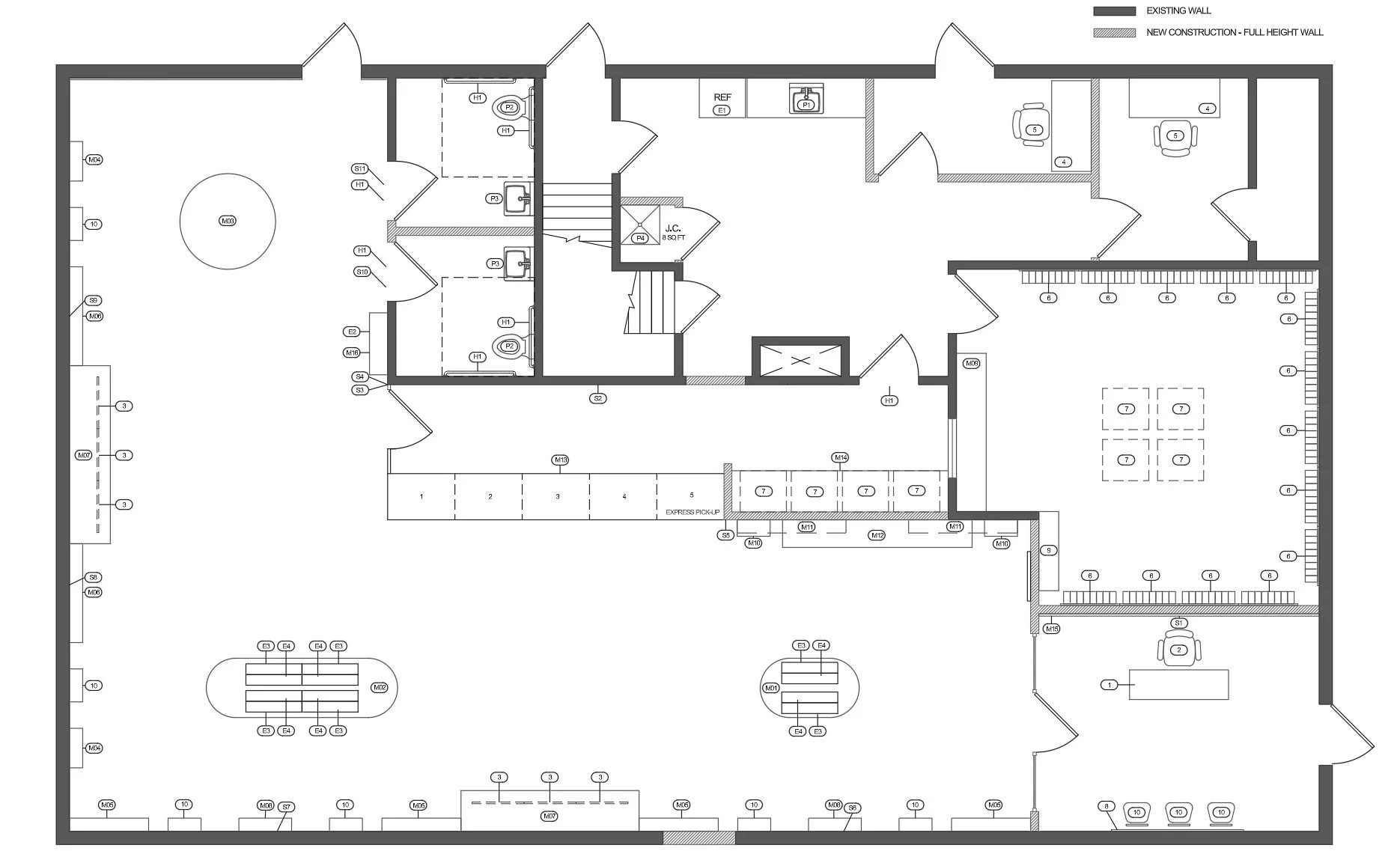
Floor plan for a dispensary project requiring the renovation of an existing building. Here we created extra workspace to the right of the POS counter while also shielding the vault from direct view.
Interior Design by Studio 36
8. Codes and Regulations
As with all commercial buildings, there are local, state, and federal building codes that need to be adhered to. Fire safety and ADA compliance are major considerations when designing a commercial space. These regulations are many and can become quite cumbersome and detailed. I would recommend working with an architect, builder, or interior designer to ensure these codes are being met. Failure to comply will be costly and delay your store opening.
Codes and regulations specific to cannabis dispensaries will vary based on your state, but there are several regulations we typically see carry-over. Some of the biggest compliance considerations include:
Designated check-in (sometimes a separate reception area / waiting room is required)
Mantrap / secure vestibule at all entrances
POS counter height - sometimes 48”H is required (IL)
Secure access to BOH, vault, security / IT room, etc. (electric / magnetic strike door lock and key card access)
No live product on the floor
Flower must be tethered to display and stored in the vault nightly
Vault interior should not be visible from sales floor
Limited or fully blocked views into the sales floor, usually with security film on windows (or use a creative method listed above)
Secure / restricted access between sales floor and staff-only POS area
Display tip: Use removable tabletop displays for easy set-up and take-down. I recommend these scenting jars from Remedy Displays. These jars integrate with The Peak Beyond’s interactive retail tech.
9. Plan for Change
The cannabis industry is still in its infancy. Regulations are inconsistent from state to state, and many are copy-pasted from early legalization laws — good and bad alike. Lawmakers are figuring this out as they go, which means rules will change.
Plan ahead by choosing fixtures that can adapt:
Floor display tables with locking cabinets
Custom wall displays with built-in storage
Modular display systems that can flex as you grow
That way, when rules loosen (for example, allowing live product on the floor), your space is ready to shift with ease.
Final Thoughts
Always consult a designer or architect before finalizing your plans. Between standard building codes and cannabis-specific regulations, skipping this step can result in costly mistakes.
Designing a dispensary is already a journey filled with hoops to jump through. Do yourself a favor: get the layout and compliance right from the start, and leave room for flexibility. Engaging with a professional early on will help you ensure the following doesn’t get overlooked:
Pre-construction planning and project timeline
Contractor and vendor coordination
Permitting and compliance checks
Material sourcing that meets both design vision and code requirements
At Studio 36, we don’t stop at design drawings. We partner with your build team, anticipate challenges before they become costly delays, and make sure every detail of your space — from lighting placement to traffic flow — is executed seamlessly. With our experience in retail and hospitality build-outs, we ensure your dispensary opens on time, on budget, and true to your brand.
This post wouldn’t be complete without dropping some love for my colleagues and favorite humans in the cannabis space - the team at Grow America Builders is truly fantastic, and I recommend them for all of your cannabis-related buildouts. Quality people that deliver quality results.
PS — all product links and company recommendations I share are non-affiliate. Just my personal faves from what I’ve seen in the marketplace.
Brittany Snyder
BFA Interior Design, NYSID
Shop! Design Awards, 2025 Gold Winner